Here’s a detailed set of 20 business card design ideas tailored to impress and communicate professionalism:
- Minimalist Monochrome: Stick to a clean design with ample white space, using black or neutral tones for text. This enhances readability and projects a modern, sophisticated feel.
- Vertical Layout: Go against the norm by designing vertically. It makes your card stand out when shuffled with others.
- Interactive Elements: Add QR codes that link directly to your portfolio or LinkedIn profile, enabling recipients to engage with your digital presence effortlessly.
- Spot UV Coating: Apply UV coating on specific elements like your logo or name for a subtle, glossy contrast that elevates your design.
- Foldable Business Cards: Create a foldable card with additional details inside, such as service listings, a short bio, or a personal message.
- Textured Paper: Use paper stocks like linen or cotton that add a tactile experience, leaving a lasting impression.
- Die-Cut Shapes: Customize the card’s shape to reflect your profession or brand theme (e.g., a camera shape for photographers or a wrench for mechanics).
- Double-Sided Design: Use the front for essential contact info and the back for a logo, tagline, or social media handles.
- Typography-Driven Design: Opt for a bold, oversized font for your name or company to make it memorable. Use clean, professional typefaces.
- Geometric Patterns: Incorporate modern, symmetrical patterns that add visual interest without overwhelming the overall design.
- Eco-Friendly Materials: Use recycled paper or bamboo to align with sustainable practices. Mention this in a subtle note to reflect environmental consciousness.
- Foil Stamping: Apply metallic foil to add a touch of luxury, especially effective for industries where opulence is part of the branding (e.g., luxury real estate, high-end consulting).
- Transparent Business Cards: Utilize semi-transparent materials to give your card a unique, modern edge.
- Color Blocks: Use contrasting colors to divide sections and make your contact details easy to spot at a glance.
- Illustrated Elements: Personalize your card with custom illustrations or doodles that align with your brand’s identity.
- Photo Inclusion: Add a professional headshot if your business relies heavily on personal branding (e.g., real estate agents, freelancers).
- Augmented Reality (AR): Integrate AR technology to link to an interactive experience when scanned, such as a short intro video or a 3D portfolio view.
- Embossed Logos: Create a raised texture for your logo using embossing. It adds dimension and ensures your brand stands out when touched.
- Holographic Effects: Use a holographic overlay for certain parts of the card to attract attention with iridescent colors when tilted.
- Custom Edge Painting: Paint the edges of your card in a bold color that complements the main design. This small detail can make a big impact when viewed in a stack.
Each of these ideas is designed to not only make your business card visually appealing but also align with various brand messages, whether it’s luxury, sustainability, or modern tech-forward aesthetics. The key is to tailor these ideas to reflect your brand’s unique voice and professional values.
Establish a lasting impact
“In a digital era, business cards still hold significance, making memorable connections essential. We have Business Card Ideas for your Success. Don’t settle for ordinary designs; embrace creativity. Ensure you stand out at networking events and conferences with unique business card ideas. Elevate your brand by incorporating distinctive design elements, logos, and graphics that leave a lasting impression. Here are 20 innovative business card ideas to guarantee you won’t be easily forgotten!” Business Card Ideas for your Success.
Simplify It
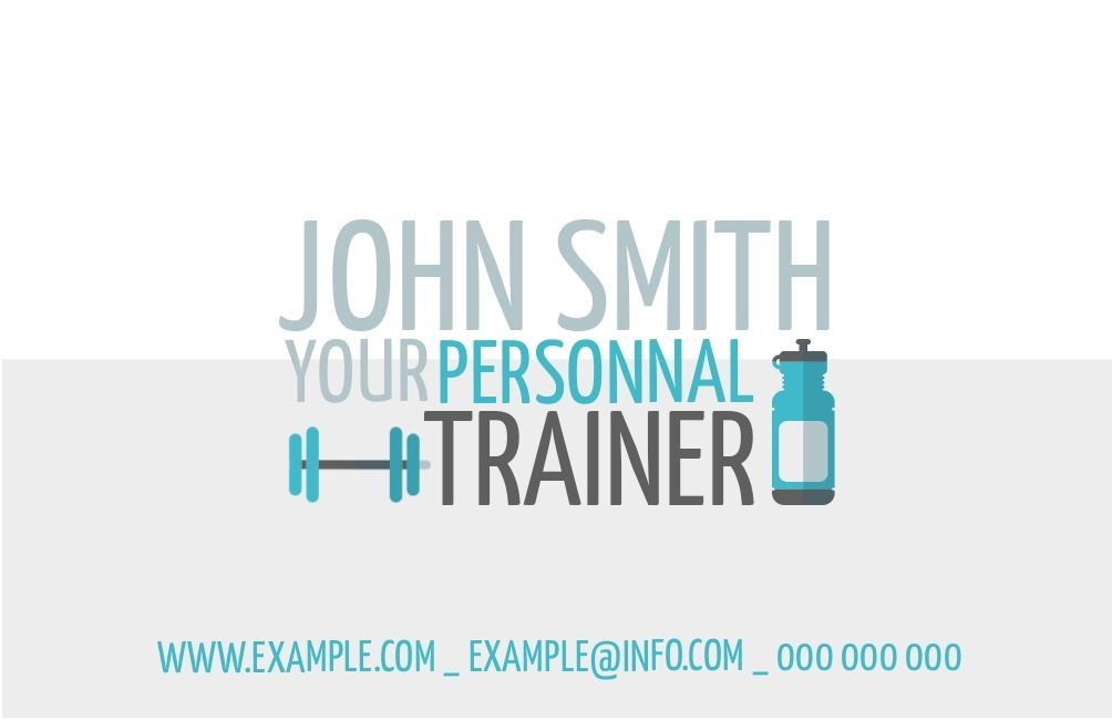
“Being simple is often overlooked. Your card can be easy yet stick in people’s minds. A card with space and just enough details – like your name, business, and contact info – puts the spotlight on you and what you do. Too much stuff can distract you. And simple doesn’t mean you can’t add a bit of clever, maybe quirky design. Quirky can be cool!”
Geometric Card Design
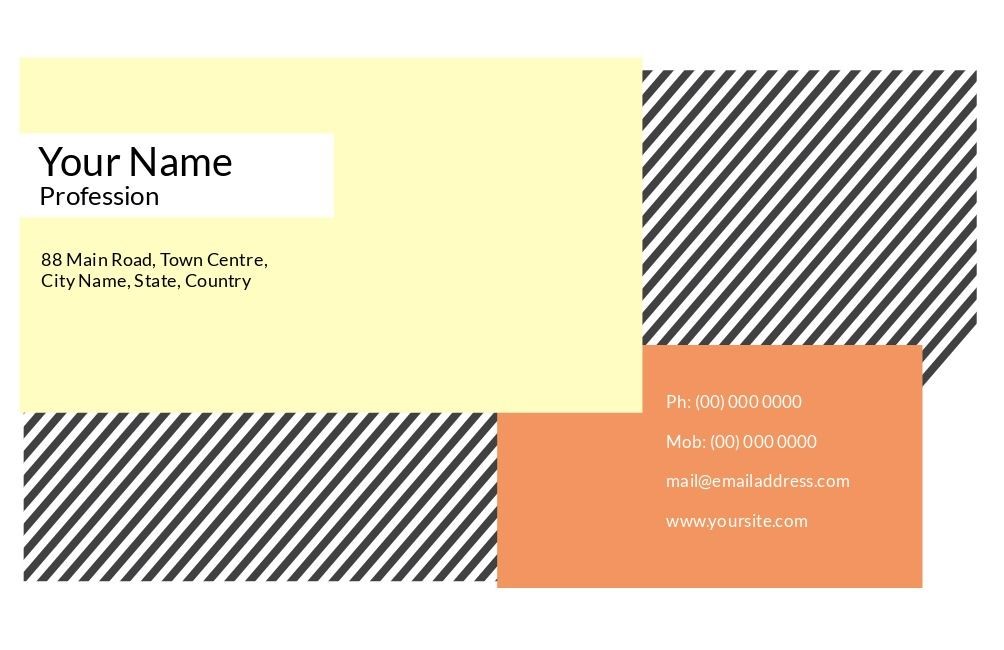
“Our eyes like clear shapes, strong rectangles, and interesting lines. Using a mostly geometric design for your business card makes a big statement. It’s not just about putting all the important info at the front; it’s also about adding some fun and maybe a bit of playfulness. With geometric design, you have flexibility, which is important when you don’t have a lot of space. Depending on how the template is set up, you can choose different ways to show your name and contact info, just like in the example above.”
Angular Designs

Complementing geometric business card concepts, designs incorporating angles bring a distinctive sharpness that naturally captures attention and guides the viewer’s focus. The interplay of interconnected angles enhances this effect, and when paired with a well-curated color palette featuring complementary shades, it further amplifies the overall effectiveness of the design.
Abstract Card Design
Business card designs don’t have to be overly straightforward. Adding an element of intrigue and prompting a second glance can significantly enhance the effectiveness of any card. For example, in the mentioned case, viewers might initially question what they are looking at. This curiosity helps ensure that your card remains memorable and stays in their thoughts. These Business Card Ideas for your Success.
Photographic Business Card

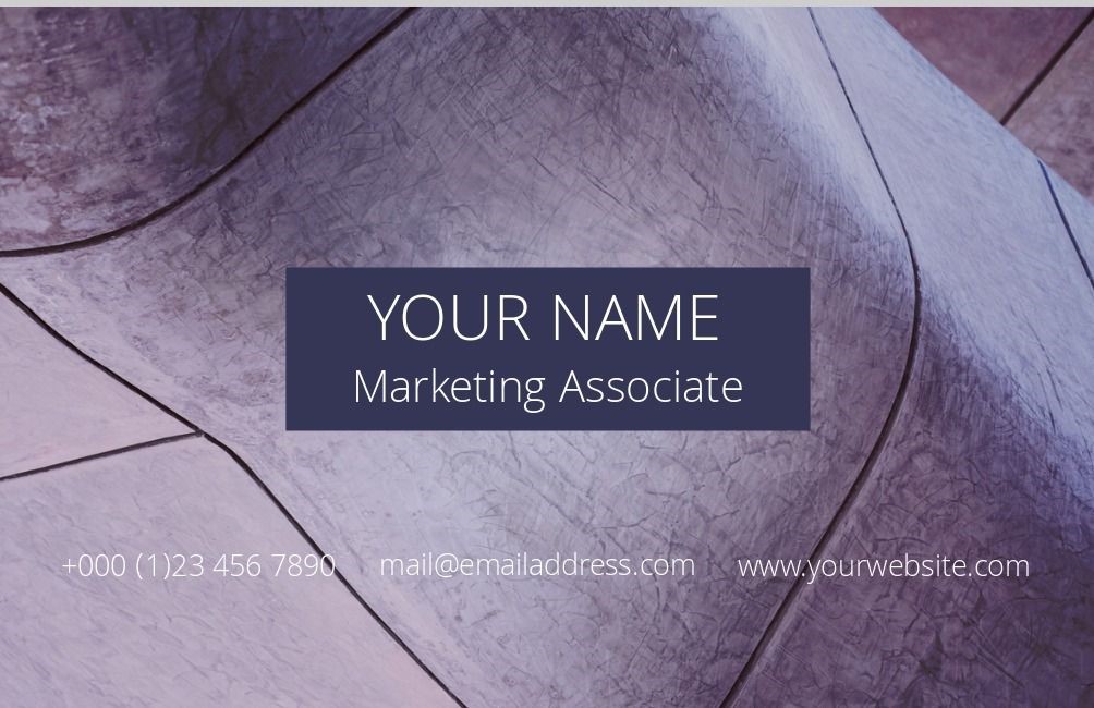
A popular and effective design choice for business cards is using actual photos. Photos are vibrant, bring depth to your card, and make your business come alive. Many people are leaning towards photo business cards for good reasons. Here are a few benefits:
- Express Personality: Photo cards let your personality shine more than a basic card. Choosing the right photos is crucial. Ask yourself, what aspect of your personality do you want the photo to reflect?
- Stand Out: Photographic cards grab more attention. A striking photo that captures some aspect of your business will give your card a distinct and memorable look. Using high-quality and affordable stock images is a great option for creating an impactful business card.
Go Retro with Your Card
Old is new again, even for business cards. The cool designs from the 80s and 90s, especially the 80s, are making a comeback with a modern twist, and they’re better than ever. It’s a fun blast from the past that’s sure to make anyone who gets your card smile. But before you dive into the retro vibe, make sure it fits with what your business is all about. While lots of companies can pull it off, it must match your business style.
Bold Color Cards
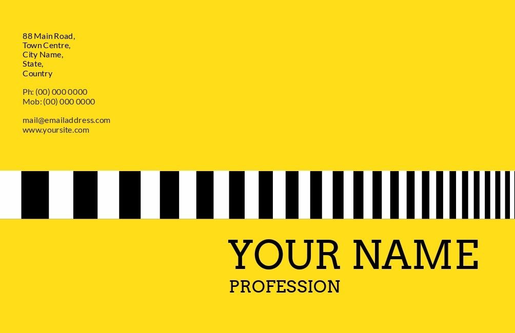
Sometimes, being bold is the way to go. Colors can say a lot, and in the example above, the bright yellow grabs your attention, leading you to the striking black-and-white graphic. Using vibrant and unexpected colors in your design opens up endless possibilities. It lets your card have a unique look and feel that reflects you.
Minimalist Design
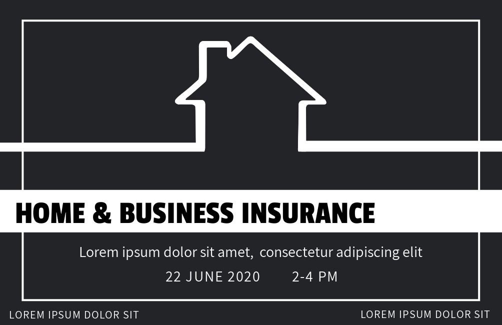
If you prefer a more understated look that still stands out, it’s all about balancing graphics, logos, and colors. Highlighting your company logo and name, done professionally and tastefully, can make a lasting impression. Minimalist design with contrasting colors is a great choice – it ensures each element pops, fulfilling the goal of creating a memorable business card.
Artwork and Icons
This design has a nostalgic vibe, not exactly retro but a cool, uncomplicated style that catches the eye. It’s a card that’s enjoyable to glance at without being overly intricate. Adding basic graphic art illustrations or icons to the background can surprisingly enhance the overall look and feel. If your job or company has specific icons tied to it like in the dental office example above, this could be a fantastic design choice.

Freeform / Sketch Style Card Design
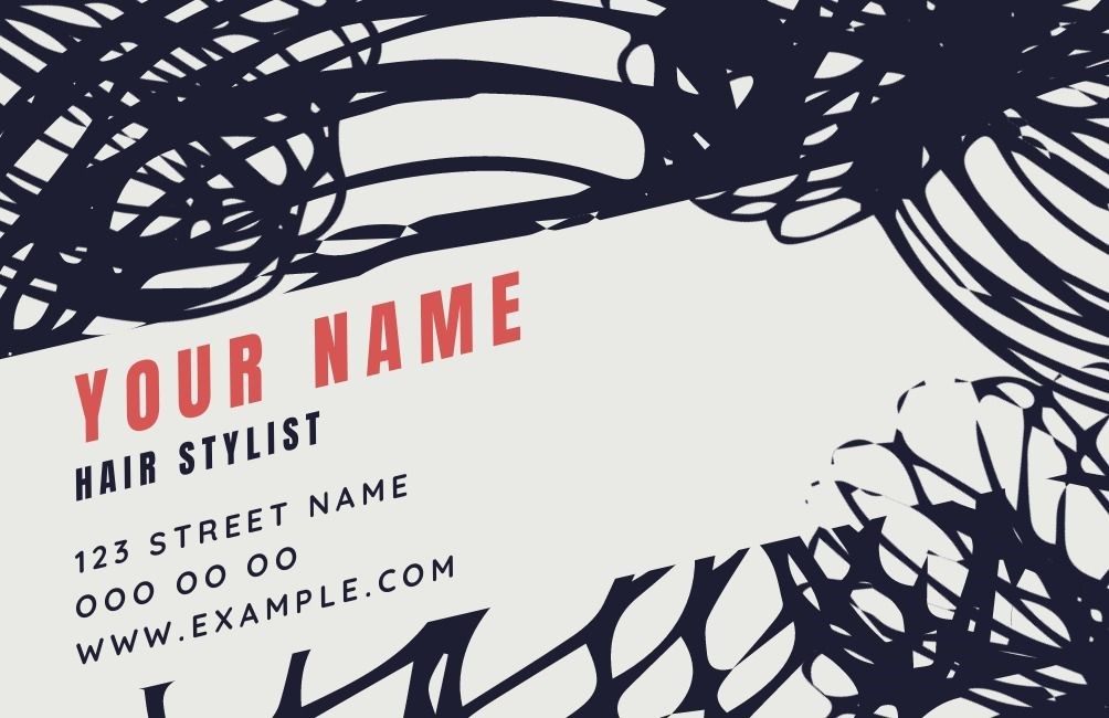
Lines don’t have to be perfectly straight, especially in creative fields. It’s fine to be a bit messy with card design. Certain professions thrive with this aesthetic. You can balance it by keeping your name/info in a more traditional font.
Playing with Silhouettes
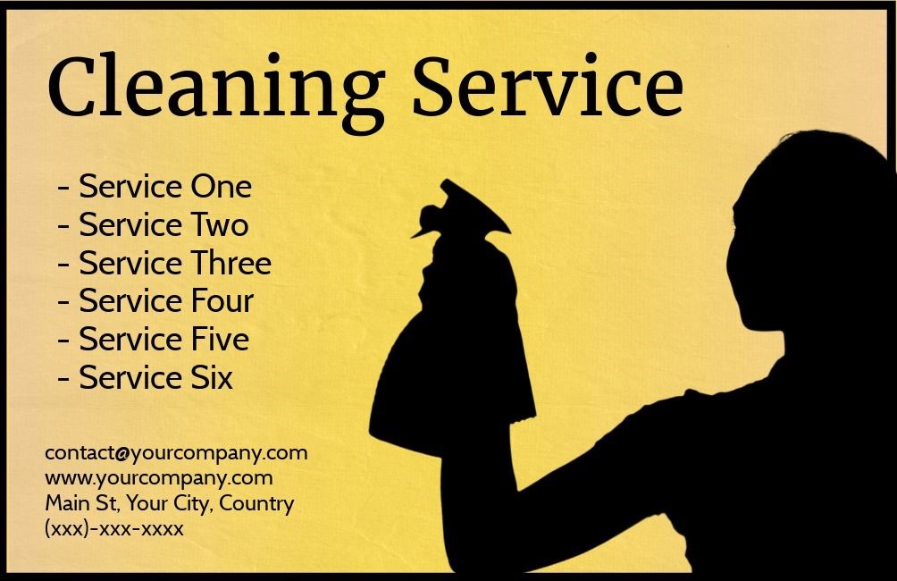
Boost your business card impact by using shadows and silhouettes. These images are powerful and, when paired with the right background color, can leave a lasting impression. Hint at who you are and what you do, letting imagination do the rest.
Multifaceted Design Approach
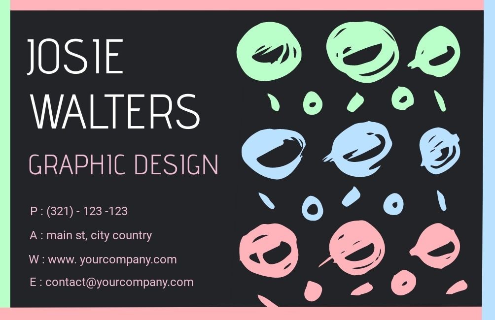
Business cards let you be as creative as you want. You’re not stuck with one style—mix ideas to match your personality and company vibe. Combine retro colors with a modern design, like this card with a hand-drawn touch. Or go for contrast and simplicity, like the template here. It’s simple but pops with light colors on a black background, giving it depth.
Dramatic Card Design

Love drama? Show it on your business card! Use black and white photos—they’re perfect for this style. Stylish elements paint a vivid picture of you or your company, uniquely capturing attention.
Cute and Fun Cards
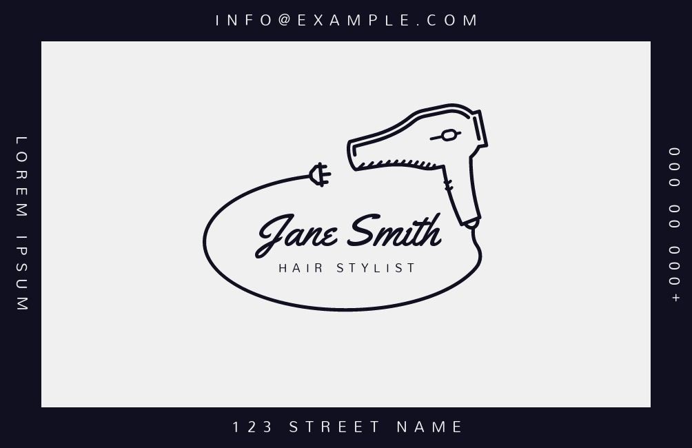
Business cards reflect your personality. Have fun with it! Create a cute, endearing image that speaks for your business. Look at this example—it’s simple but interesting. The image tells the story, and even a dryer cord around the name adds a playful touch. Think creatively. Is there a clever way to use an image related to your job on your business card? Make it memorable!
The Straightforward Business Card
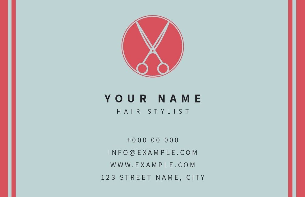
Some like it straightforward—get to the point, add necessary info, and maybe a touch of color. Business cards offer endless possibilities. There are tons of designs, styles, and elements to choose from, and almost anything goes. As long as it fits you and gives the necessary info, it’s perfect. Many templates exist because everyone has unique tastes. What’s yours?
Vertical Style Cards
Make your card stand out by breaking the norm. Most cards are horizontal, so why not go vertical? You keep design flexibility and add a unique touch by positioning text/images differently. Imagine at a conference, people flip through cards in the same direction, and suddenly, there’s yours. They have to rotate it to read—making it memorable.

Photo Collage Business Cards
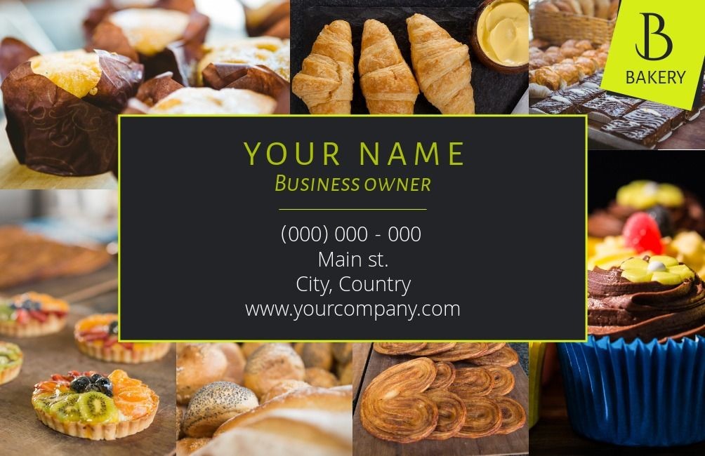
Photo cards are great, but consider a photo collage card for a more comprehensive showcase. Instead of one image, use several to represent your business fully. Like this bakery card—display your best pastries and leave them eager for more!
A Layered Design
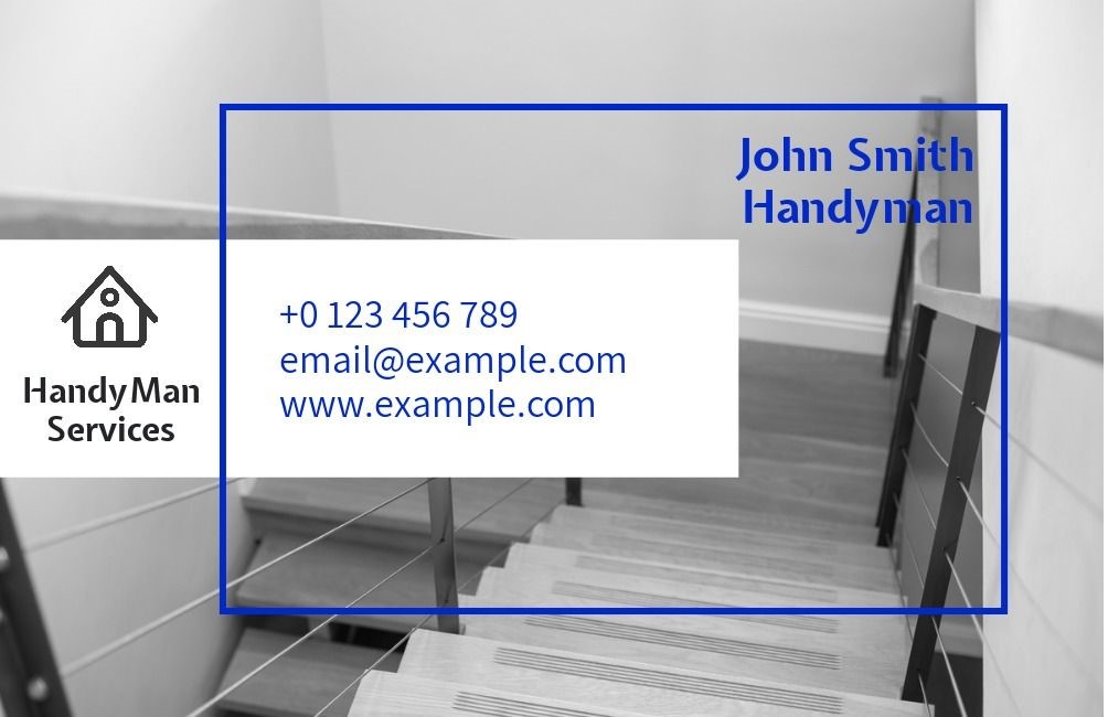
Even for a simple handyman service, you can make your business card look classy with a layered design. This style combines shapes, text, pictures, and a splash of color to give your card a more sophisticated feel.
The cool thing about using layers with drawings, graphics, and photos is that it works for any job or business. It brings a level of elegance to the card that’s not easy to achieve otherwise.
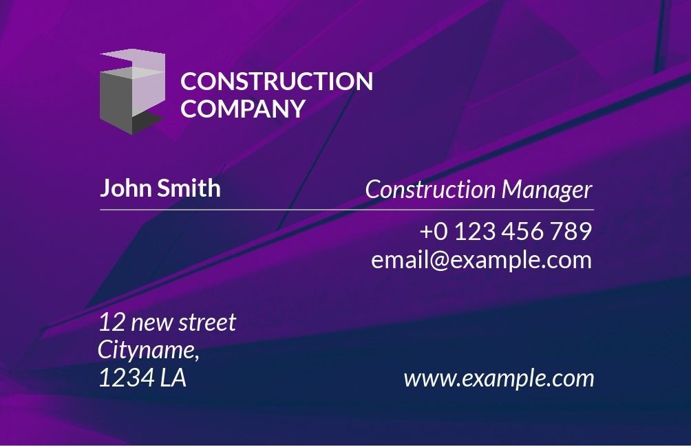
Monochromatic Patterns
Experimenting with different shapes and patterns using just one color or various shades of that color can create a strong impression. The design’s complexity captures the viewer’s attention, and since it’s all one color with subtle shading,
it becomes even more captivating. This also makes the text and logo more noticeable.
Cards that Utilize Motion
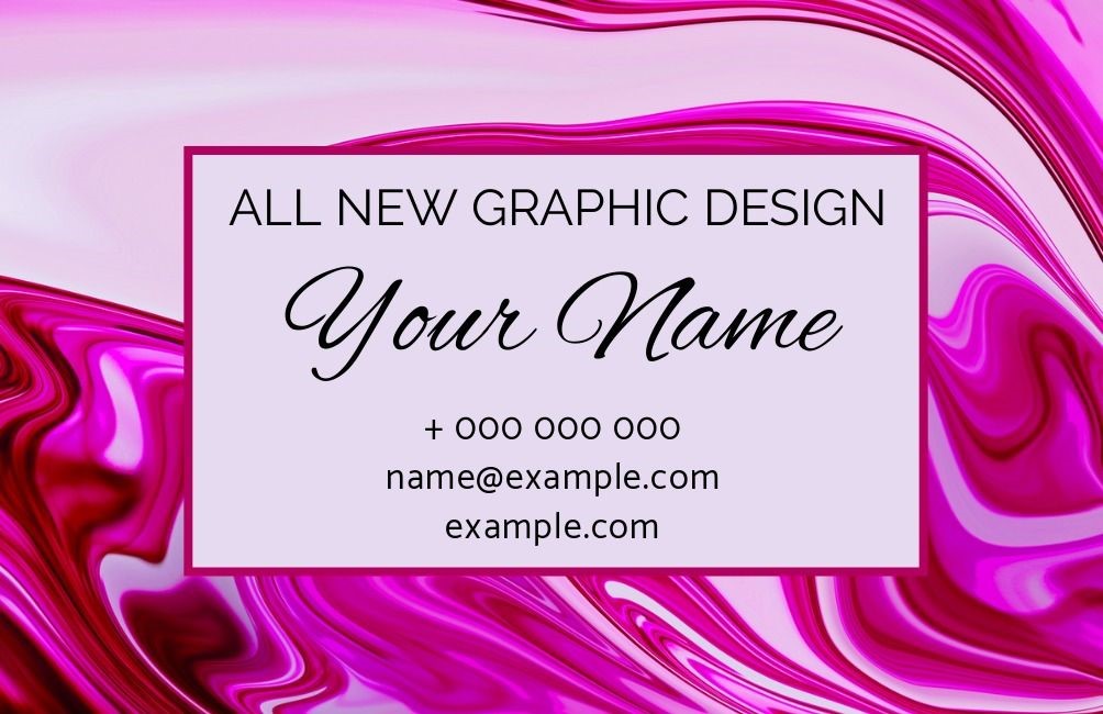
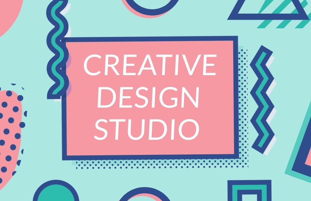
Patterns like swirls or waves easily grab our attention. They create a sense of movement on a card and guide our eyes. In this example, the eye is drawn towards the center text box because of the flowing pink waves surrounding it. It’s well-executed and looks great! Business Card Ideas for your Success.
1. What Makes a Business Card Design Effective?
An effective business card design seamlessly blends form and function, delivering essential information in a visually appealing manner. A good business card should:
- Clearly communicate your identity: Display your name, title, company, and contact information legibly.
- Reflect your brand: Maintain alignment with your brand’s color scheme, logo, and typography.
- Prioritize readability: Use fonts and colors that are easy to read and avoid clutter.
- Use high-quality materials and printing techniques: These enhance perceived professionalism and longevity.
2. How Can I Make My Business Card More Memorable?
To ensure your business card stands out, consider:
- Unique design elements: Include features such as embossing, die-cut shapes, or foil stamping.
- Innovative formats: A vertical or foldable design catches attention.
- Interactive components: Integrate QR codes or links to digital portfolios.
- Tactile experiences: Use textured or specialty paper to create a more impactful feel.
- Personal touches: Adding a custom illustration or using edge painting can help your card be more distinctive.
3. What Are the Key Elements of a Successful Business Card?
A successful business card contains the following elements:
- Logo: A clear representation of your brand.
- Name and Title: Your name and professional title or role.
- Company Name: The organization you represent.
- Contact Information: Phone number, email address, and possibly a physical address.
- Website and Social Media: Relevant URLs and handles.
- Tagline or Call-to-Action: A brief line that summarizes your value or prompts further engagement.
- Consistent Branding: Use colors, fonts, and design elements that align with your brand’s visual identity.
4. How Do I Choose the Right Design for My Business Card?
Choosing the right design depends on:
- Industry and audience: A creative field might call for bold, artistic cards, while a corporate or legal field should stick to clean, professional designs.
- Personal brand: Ensure the design resonates with your personal brand or business ethos.
- Functionality: Decide if you need extra space for details, foldable options, or dual-language versions.
- Design trends: Minimalism, bold typography, or geometric patterns can enhance the card’s look if suitable for your brand.
- Feedback: Run a draft by colleagues or trusted clients to see if the design effectively conveys your intended message.
5. What Are the Best Materials for Business Cards?
The choice of material greatly affects the feel and durability of a business card. Some of the best options include:
- Standard card stock: A versatile, cost-effective option.
- Laminated card stock: Provides a smooth finish and extra durability.
- Textured paper: Adds a unique tactile element and feels high-end.
- Recycled paper: Eco-friendly and shows commitment to sustainability.
- Cotton or linen: Offers a luxurious and sturdy feel.
- Metal or plastic: Provides a modern and durable option, although pricier.
- Transparent or frosted plastic: Creates a contemporary and sleek look.
6. How to Design a Business Card That Stands Out
To design a memorable business card:
- Incorporate Unique Shapes: Utilize die-cut techniques to create a non-traditional shape that aligns with your brand.
- Use High-Quality Materials: Opt for textured paper, metallic finishes, or laminated coatings to create a tactile experience.
- Add Embellishments: Use foil stamping, spot UV coating, or embossing for a luxurious feel.
- Choose Bold Colors and Contrasts: Vibrant or complementary color schemes can make the design pop while staying true to your brand’s palette.
- Include a Visual Hook: Consider custom illustrations, patterns, or a compelling image that showcases your industry expertise.
7. Step-by-Step Guide to Creating Effective Business Cards
Step 1: Define Your Purpose
- Determine the key message you want the card to convey (e.g., professionalism, creativity, sustainability).
Step 2: Gather Essential Information
- Name, job title, company, contact info, website, social media, and a tagline or call-to-action.
Step 3: Choose a Layout
- Decide between horizontal, vertical, or folded formats. Keep the hierarchy of information in mind, placing the most critical details prominently.
Step 4: Select a Design Theme
- Choose colors, fonts, and icons that align with your brand’s visual identity.
Step 5: Integrate Special Features
- Use embossing, foil stamping, or edge painting to add a unique touch.
Step 6: Finalize and Proofread
- Ensure there are no typos and that contact details are accurate.
Step 7: Print a Sample
- Print a test version to check color accuracy and overall quality.
Step 8: Print Professionally
- Work with a reputable printing service for high-quality results.
8. Tips for Crafting the Perfect Business Card Design
- Prioritize Legibility: Use fonts that are clear and large enough to read at a glance.
- Balance White Space: Don’t overcrowd the design; ample white space improves readability.
- Stick to a Consistent Brand Image: Use your brand’s colors, fonts, and style for consistency.
- Optimize for Portability: Ensure the card size is practical (typically 3.5 x 2 inches).
- Incorporate a Call-to-Action: Subtle prompts like “Scan QR for portfolio” or “Connect on LinkedIn” can encourage engagement.
9. How to Choose the Right Elements for Your Business Card
- Logo: Central to your branding; ensure it’s high resolution and well-placed.
- Color Scheme: Reflects your brand’s personality—choose between bold, professional, or subdued palettes based on your target audience.
- Fonts: Use 1-2 complementary fonts to maintain visual harmony.
- Graphics and Icons: Keep them minimal and relevant to avoid clutter.
- Contact Details: Display the most essential information prominently, such as your phone number, email, and website.
10. Designing Business Cards: A Comprehensive Tutorial
Step 1: Start with a Template
- Use design software like Adobe Illustrator, Canva, or specialized services like Vistaprint for a starting point.
Step 2: Set Up the Layout
- Ensure dimensions include bleed areas (extra space for cutting to prevent trimming design elements).
Step 3: Add Core Elements
- Insert the logo, name, title, and essential details. Keep a visual hierarchy to guide the reader’s eye.
Step 4: Design the Back of the Card
- Use the back to include a tagline, social media icons, or a QR code.
Step 5: Add Special Features
- Layer in options like raised text or metallic ink for standout effects.
Step 6: Choose Your Print Material
- Decide on paper type (e.g., textured, glossy, matte) and weight for the desired durability.
Step 7: Proof and Revise
- Double-check spacing, alignment, and color contrast. Solicit feedback from colleagues or peers.
Step 8: Send to Print
- Partner with a high-quality printing company that offers the features you’ve selected (e.g., embossing, foil stamping).